|
5/9/2017 May 9, 2017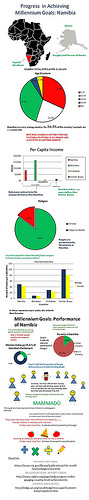 Infographic Project update:
Students have submitted the first slide of information as mentioned in the previous post (011-7). The next activity was gathering statistics on their assigned countries to be compared with other African countries and putting the data into a table to indicate the performance indicators being compared and the corresponding Global Goal. (012-7) The data chart was due on April 26. Those two activities have been scored and entered into PowerSchool. If the score is missing that means the assignment has yet to be turned in. (Open lab has been offered but there are very few takers!) For the past 2 weeks students have been working to turn the data in the table into three separate column charts. This part of the infographic should be turned in no later than May 17, although most students should be able to finish by May 10. On Wednesday, May 10, I will be explaining the final portions of the infographic and how to put all the pieces together. The last part will be to provide information about some organization that is working in the country to help achieve one or more of the goals and add appropriate graphics. With a resource section at the bottom the infographic is ready to be turned into a single image and published. That means we have to make use of every minute. If a student is behind in completing work due to absence it is important that they see me about time in the lab in order to get the final product completed. The infographics will be shared in a blog post at the end. The image at the right is an example of an infographic completed by a student in an earlier year. Although a few details have changed for our project, you can get the idea of what our finished infographic should be like. See the infographic full size. Comments are closed.
|
 RSS Feed